Dark Grain Cinema
Apply this design skill
Read the SKILL.md at https://joincommons.cc/api/items/dark-grain-cinema and apply its design language to my project
Designed by humans. Applied by agents.
Design Language
All colors use oklch for perceptually uniform, warm-tinted neutrals.

| Token | Value | Material Name | Usage |
|---|---|---|---|
| `--bg` | `oklch(0.12 0.015 55)` | Screening room dark | Page background |
| `--surface` | `oklch(0.16 0.012 55)` | Film canister | Cards, panels |
| `--surface-image` | `oklch(0.18 0.01 55)` | Empty film frame | Image placeholder background |
| `--text` | `oklch(0.82 0.01 80)` | Projector light | Primary text |
| `--muted` | `oklch(0.50 0.01 60)` | Faded print | Secondary text, metadata |
| `--accent` | `oklch(0.70 0.10 70)` | Projector lamp amber | Brand, active nav, CTAs only |
| `--border` | `oklch(0.25 0.01 55)` | Light leak edge | Hairline dividers, card borders |
| Nav scrim | `oklch(0.10 0.015 55 / 0.9)` | Dark top fade | Nav gradient start |
| Image dark | `rgba(10, 8, 6, 0.65)` | Vignette pool | Vignette gradient end |

**Rule**: Every neutral uses hue 55–80. Never use neutral grays with hue 0 or cold blues.
Agent instructions (SKILL.md)(advanced)
Design Skill
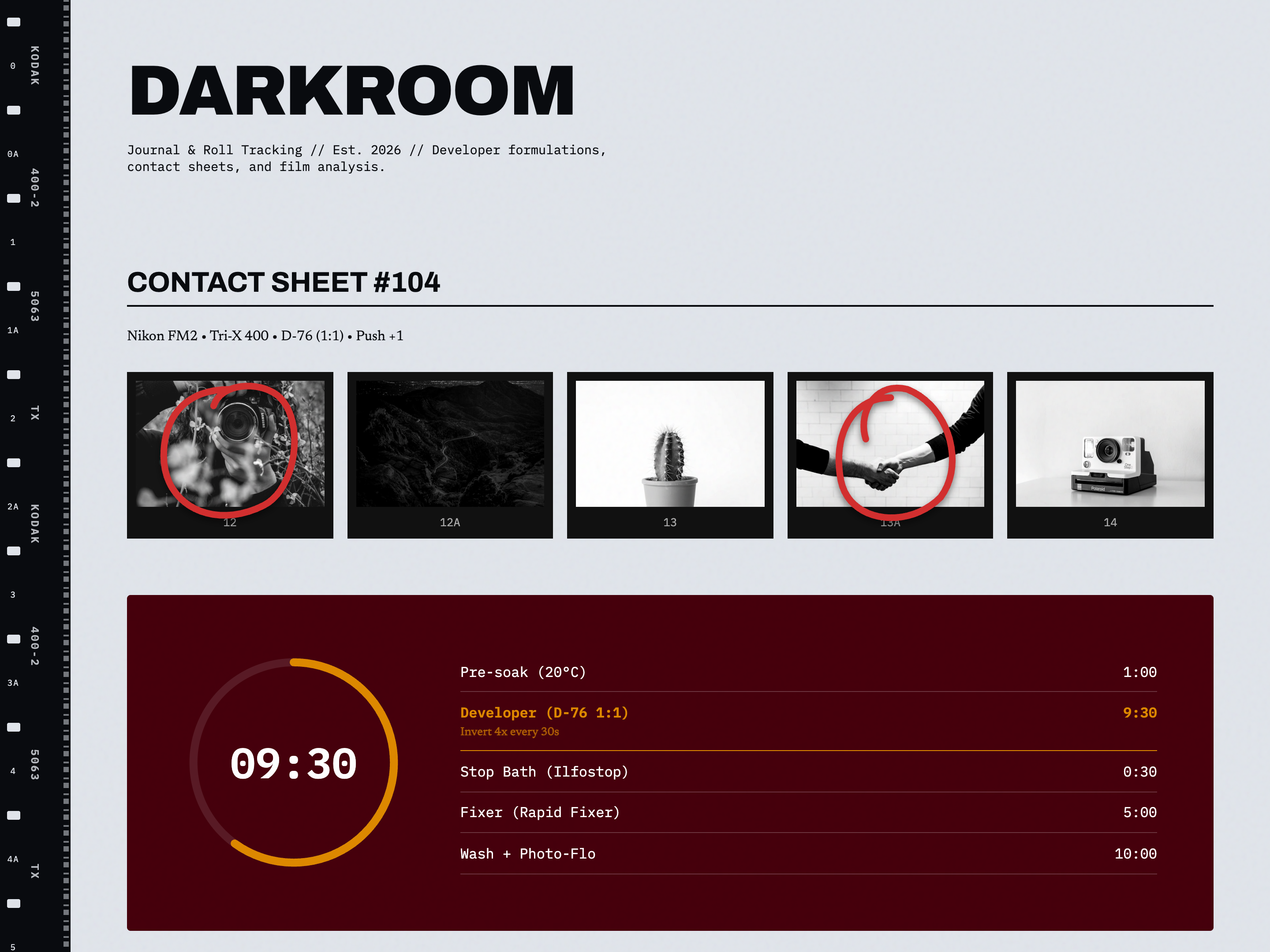
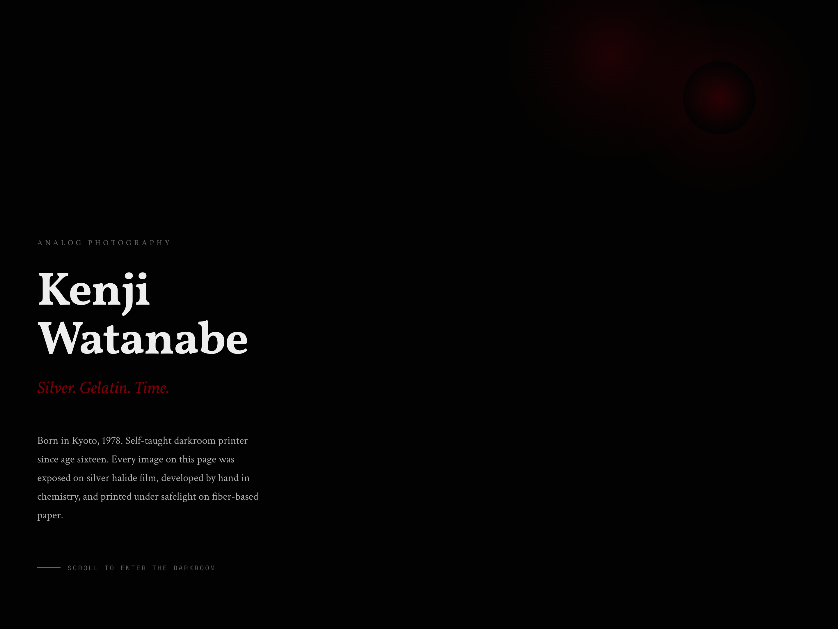
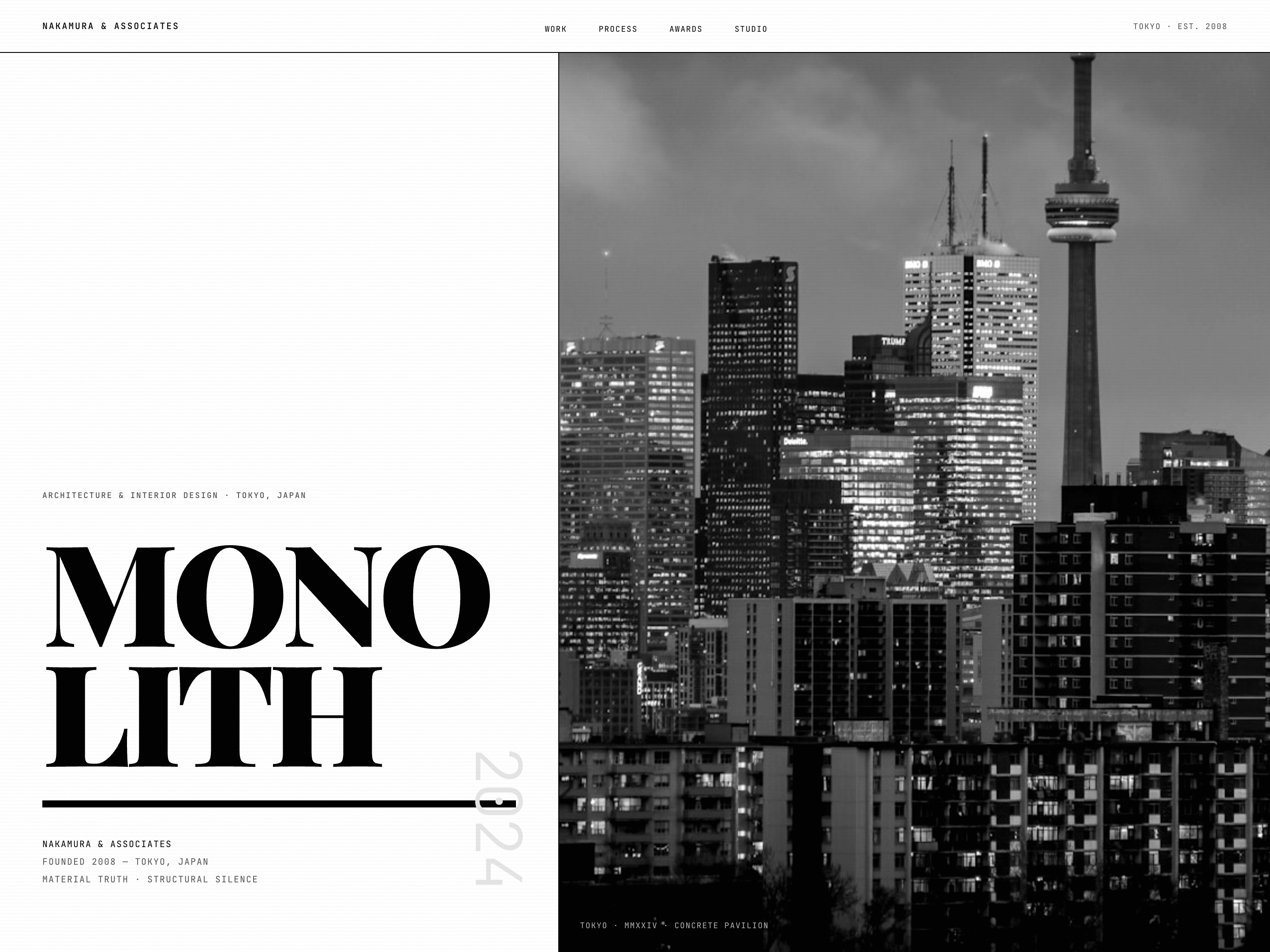
### Core Principle
**Every Frame is a Still.** The page is a strip of 35mm film — grainy, desaturated, cinematic. Film grain is the foundational texture that unifies everything under a single celluloid surface. Aspect ratios are anamorphic widescreen (2.39:1). Edges darken with natural vignette. The palette is near-monochrome because real cinema earns its color.

### Visual Vibe
**Emotional Keywords**: Cinematic, Grainy, Desaturated, Intimate, Auteur, Analog, Moody, Contemplative, Independent, Darkroom

Real-world references:
- The Criterion Collection — physical packaging and editorial voice
- A24 film marketing — spare, literary, image-first
- Gregory Crewdson photography — cinematic staging, eerie stillness
- A 35mm contact sheet on a darkroom lightbox

### What This Design Is NOT
- Not a Netflix clone — no bright poster carousels, no autoplaying anything
- Not pure black — cinema dark is **warm**, tinted toward brown and sepia
- Not saturated — chroma below 0.05 everywhere except ONE amber accent
- Not rounded cards with drop shadows — this is film, not a SaaS product
- Not bright, cheerful, or fast — this is contemplative and unhurried
- Not a music or podcast platform wearing cinema clothes

### The DNA
1. **Living grain** — a fixed SVG feTurbulence filter over the entire viewport, seed-animated to breathe like real celluloid. It sits above everything, unifying all elements.
2. **Anamorphic framing** — hero images and film stills fill a 2.39:1 (21:9) frame with letterbox bars above and below, like a projector gate.
3. **Vignette as lens** — radial darkening on key images mimics the natural falloff of vintage cinema lenses, drawing the eye to center frame.
4. **Desaturation as statement** — all images run through `saturate(0.25–0.35) contrast(1.1–1.2)`, the look of Kodak Tri-X pushed one stop.
5. **Sprocket-hole dividers** — section breaks are film strip fragments (small rounded rectangles flanked by hairline rules), not `<hr>` elements.
6. **Long-take pacing** — sections are separated by 7rem+ breathing room. Content fades up slowly at 1.2s. Nothing rushes.