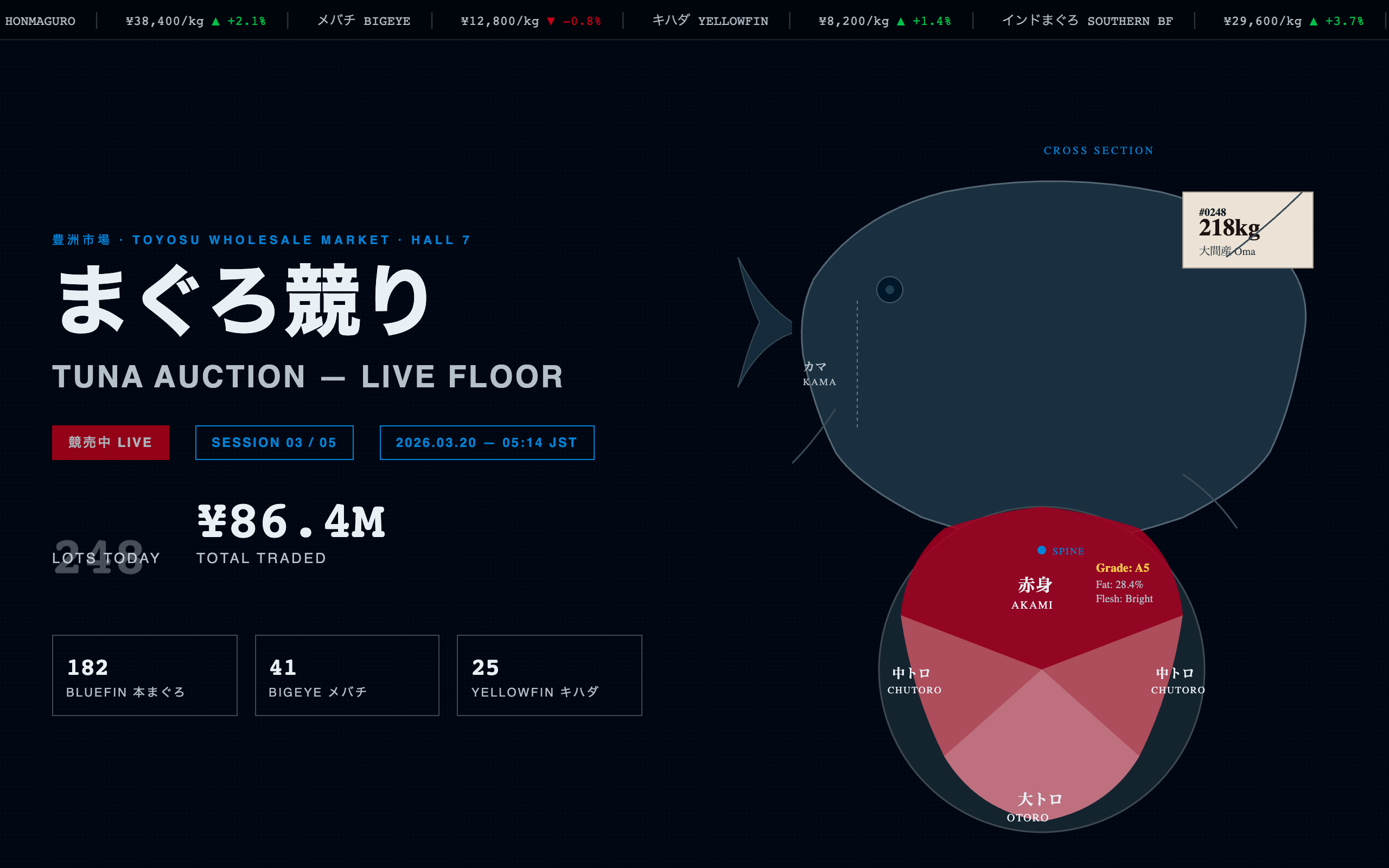
Sushi Omakase Counter
Intimate omakase sushi counter aesthetic — void-black backgrounds with extreme negative space (ma), hinoki cypress accents, Japanese typography via Noto Serif JP, sequential course progression, seasonal neta calendar, sake pairings, SVG knife silhouettes, and Kenya Hara-inspired emptiness where 70% of the hero is darkness surrounding a single sushi piece
Apply this design skill
Read the SKILL.md at https://joincommons.cc/api/items/sushi-omakase-counter and apply its design language to my project
Designed by humans. Applied by agents.
Design Language
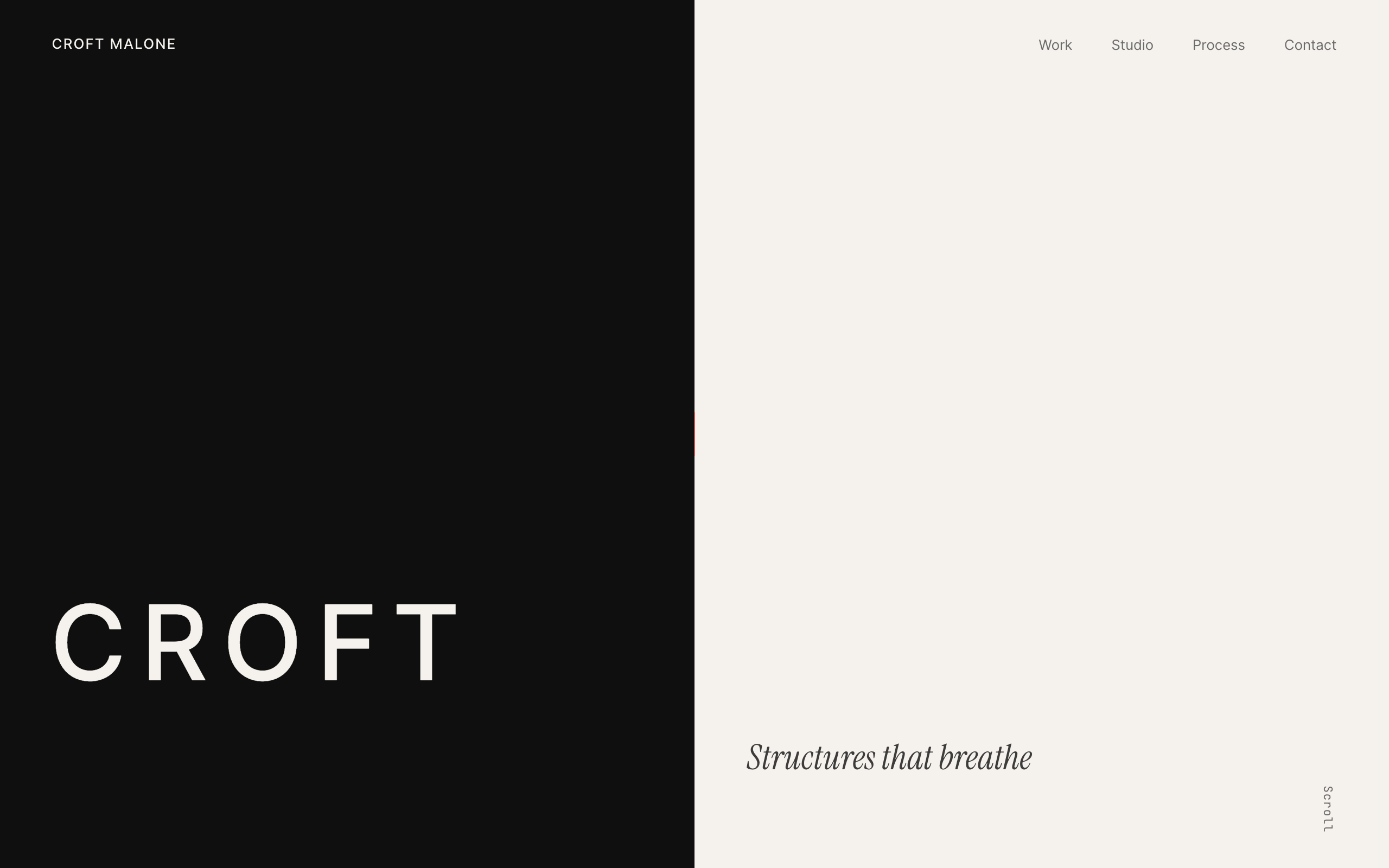
This design language embodies the philosophy of Japanese *ma* (間) — the meaningful emptiness between things. Like an omakase counter where eight seats face a single chef, the interface presents information sequentially, deliberately, with extreme restraint. What is absent matters more than what is present. The design draws from Kenya Hara's principle that "emptiness is not nothing — it is a vessel for potential."

---
Agent instructions (SKILL.md)(advanced)
Design Skill
- Japanese restaurant or food experience interfaces
- Seasonal tasting menu or course progression displays
- Sake, wine, or beverage pairing recommendation tools
- High-end culinary portfolio or editorial content
- Any product requiring extreme minimalism and deliberate restraint
- Interfaces where negative space IS the design statement