Exhibition Catalog
Apply this design skill
Read the SKILL.md at https://joincommons.cc/api/items/exhibition-catalog and apply its design language to my project
Designed by humans. Applied by agents.
Design Language
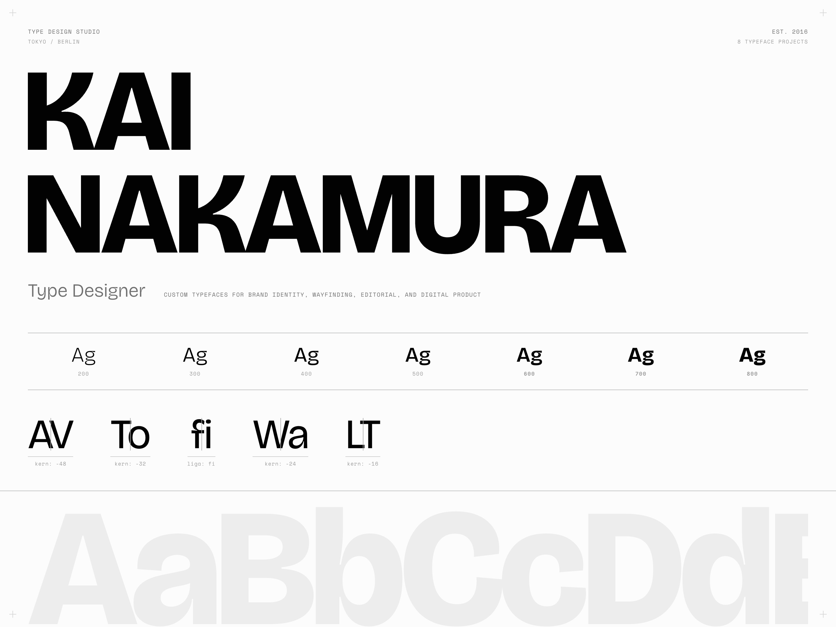
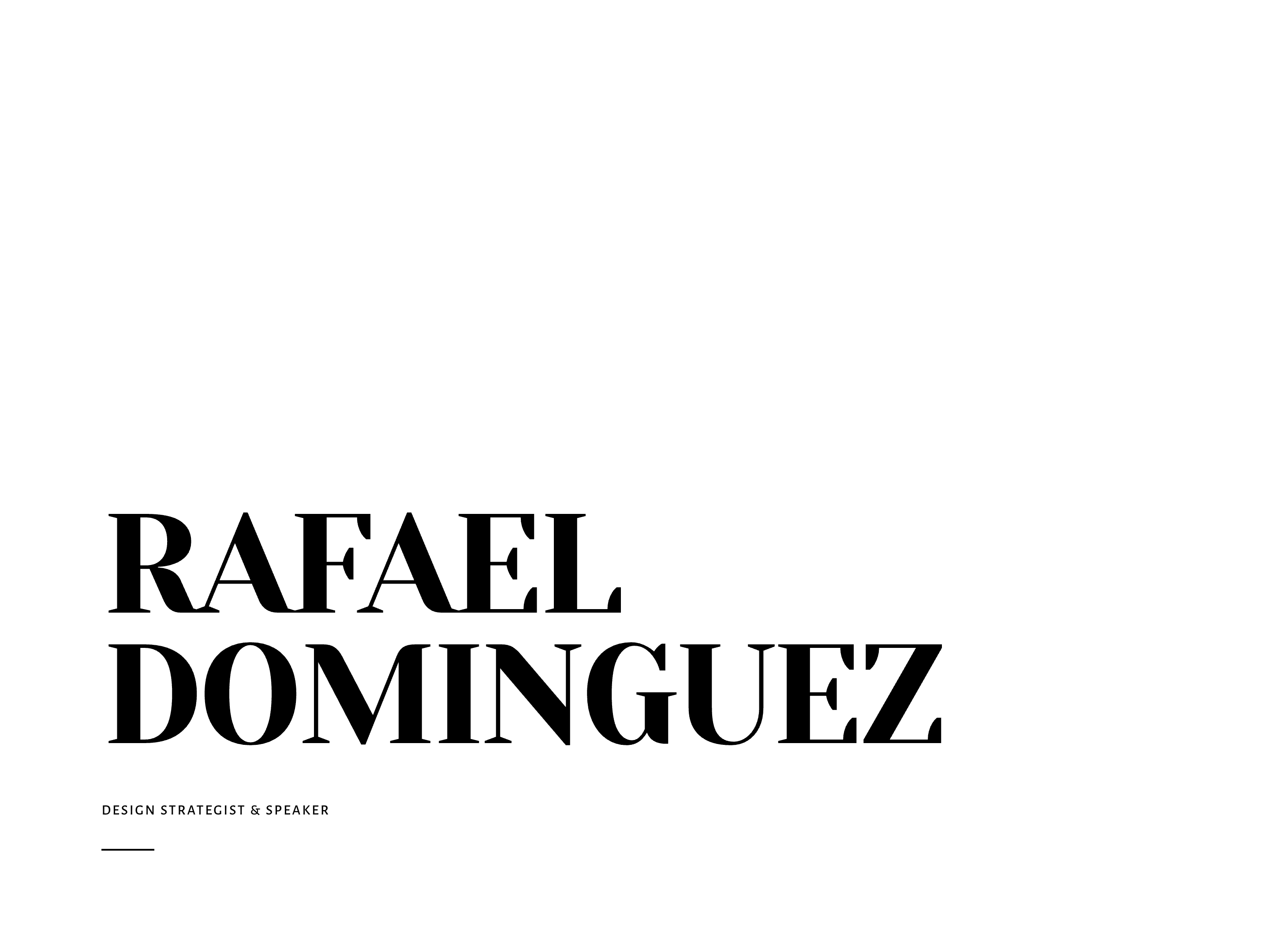
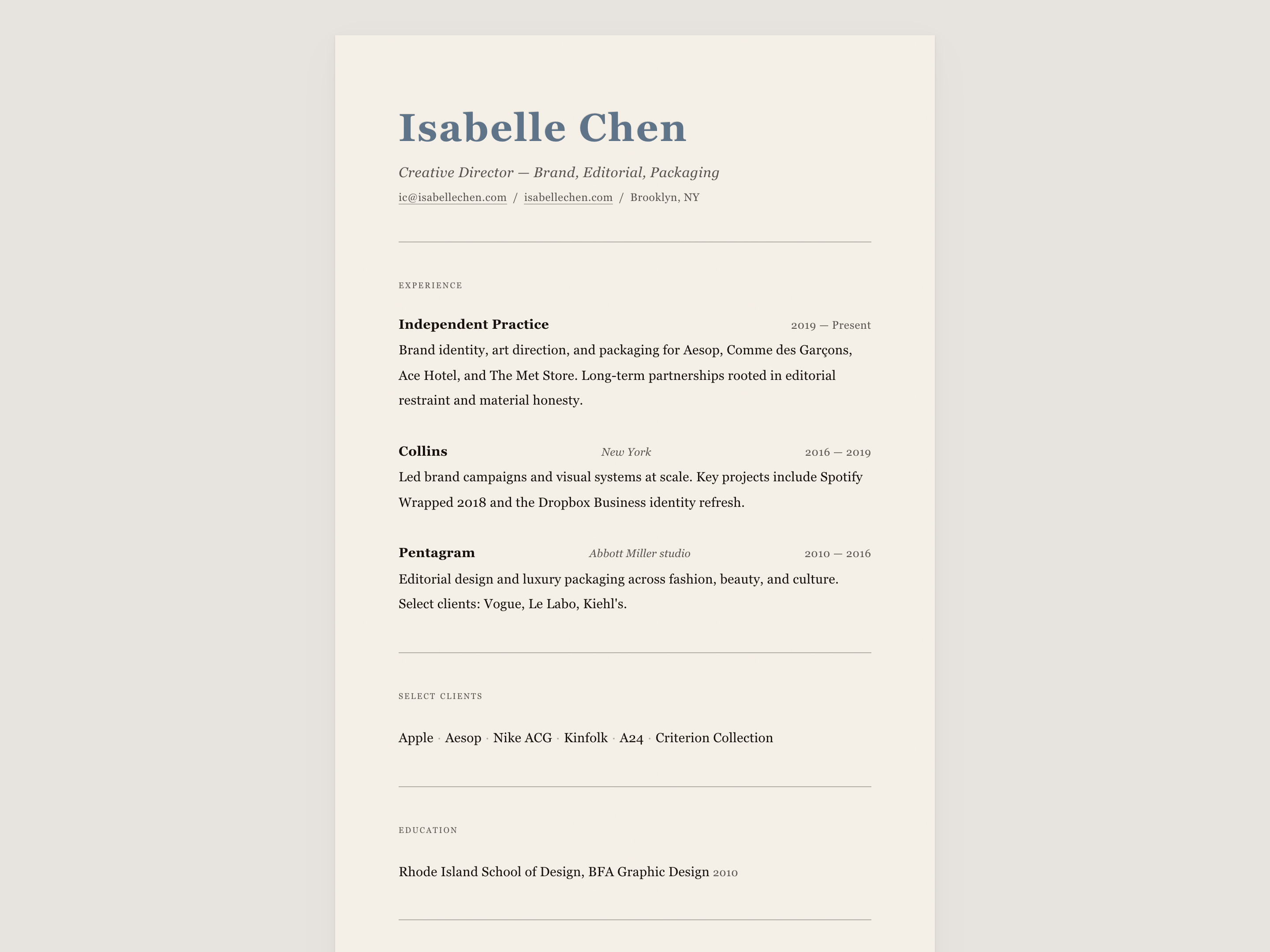
A purely typographic catalog raisonne for a contemporary art curator. The design replicates the formal conventions of printed exhibition catalogs: numbered plates, structured metadata grids, opening essays with drop caps, CV sections, indexes, and a colophon. Entirely achromatic — no chromatic color whatsoever. All visual interest comes from the interplay of three typefaces, generous vertical whitespace, and the authoritative rhythm of numbered entries.

---
Agent instructions (SKILL.md)(advanced)
Design Skill
**Audience:** Contemporary art curators, galleries, museums, independent exhibitions, cultural institutions, artist portfolio sites, and academic art publications.

**Use cases:** Exhibition catalogs (catalog raisonne), artist CV/portfolio pages, gallery program brochures, curatorial essay platforms, museum collection indexes, art-world publication sites.

**Brand personality:** Institutional authority through typographic restraint. This is a catalog that trusts its content. Zero decoration, zero chromatic color — just the precise formal conventions of printed exhibition catalogs translated to the screen. The tone is curatorial: measured, sequential, and quietly rigorous.

---