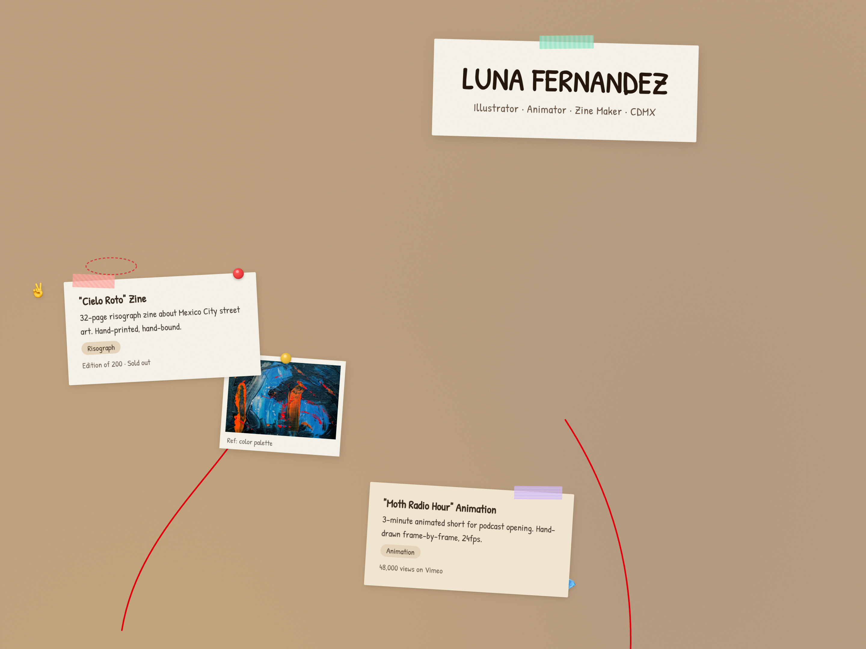
Ceramic Studio Folio
Museum-catalog ceramics portfolio with organic blob-shaped image containers, SVG vessel silhouettes with glaze-colored fills, Gilda Display / Alegreya Sans / Fira Mono triple type stack, warm OKLCH palette (ash-white, tenmoku, celadon, shino, iron-red), specimen data cards, kiln-temperature timeline gradient, and tenmoku-tinted shadows throughout.
Apply this design skill
Read the SKILL.md at https://joincommons.cc/api/items/ceramic-studio-folio and apply its design language to my project
Designed by humans. Applied by agents.
Design Language
- **Brand name:** Sofia Morales Studio (nav wordmark in tracked monospace uppercase)
- **Tagline register:** "Earth, water, fire — and the patience between"
- **Voice:** Quiet, material, reverent. Short declarative sentences. The hand and the kiln are co-authors.
- **Recurring motif:** Organic blob-shaped containers (`border-radius` with asymmetric percentages) that echo thrown ceramic forms — no rectangles anywhere images appear.

---
Agent instructions (SKILL.md)(advanced)
Design Skill
**Brand archetype:** A solo ceramicist's portfolio site — museum-catalog precision meets artisan warmth. Think Sofia Morales, not Crate & Barrel.

**Target audience:** Collectors, gallery curators, design journalists, and commission clients who expect craft to be presented with the same rigor as fine art. They visit Zona Maco and Design Miami, read Cereal Magazine, and buy objects with provenance stories.

**Use cases:** Ceramic artist portfolio, potter studio site, gallery exhibition page, artisan craft catalog, handmade goods folio, sculpture studio, glassblower portfolio, any maker who presents individual pieces as named specimens with technical data.

**Brand personality:** Quiet authority. Material honesty. The voice is declarative and unhurried — clay teaches patience, and the site reflects that patience. The aesthetic sits between a Japanese ceramics exhibition catalog and a Oaxacan craft gallery.

---