Atlas Dashboard
Enterprise SaaS design system: clean hierarchy, neutral palette with blue accent, data-dense layouts, card-based dashboards, Inter typography, subtle shadows
Apply this design skill
Read the SKILL.md at https://joincommons.cc/api/items/atlas-dashboard and apply its design language to my project
Designed by humans. Applied by agents.
Design Language
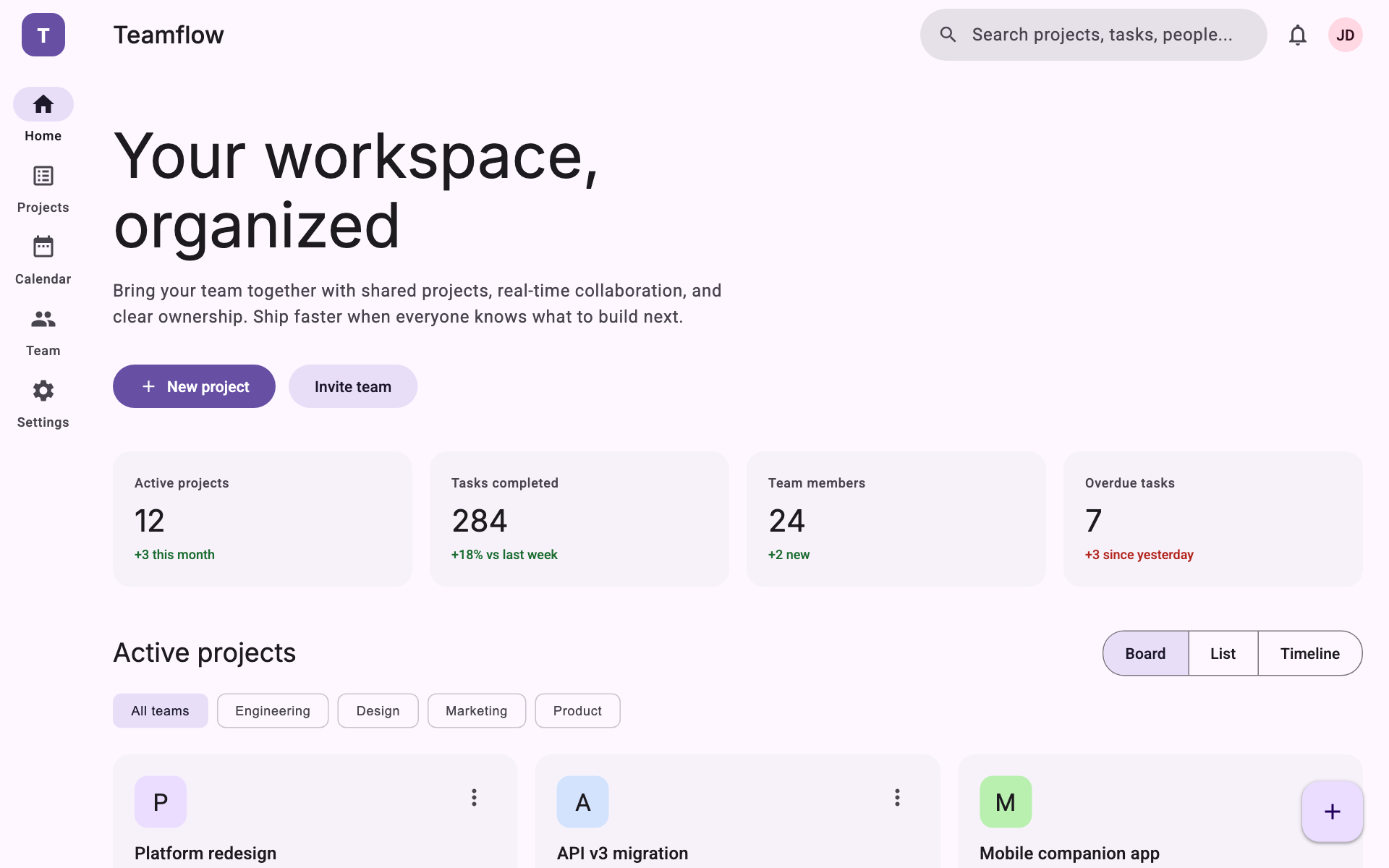
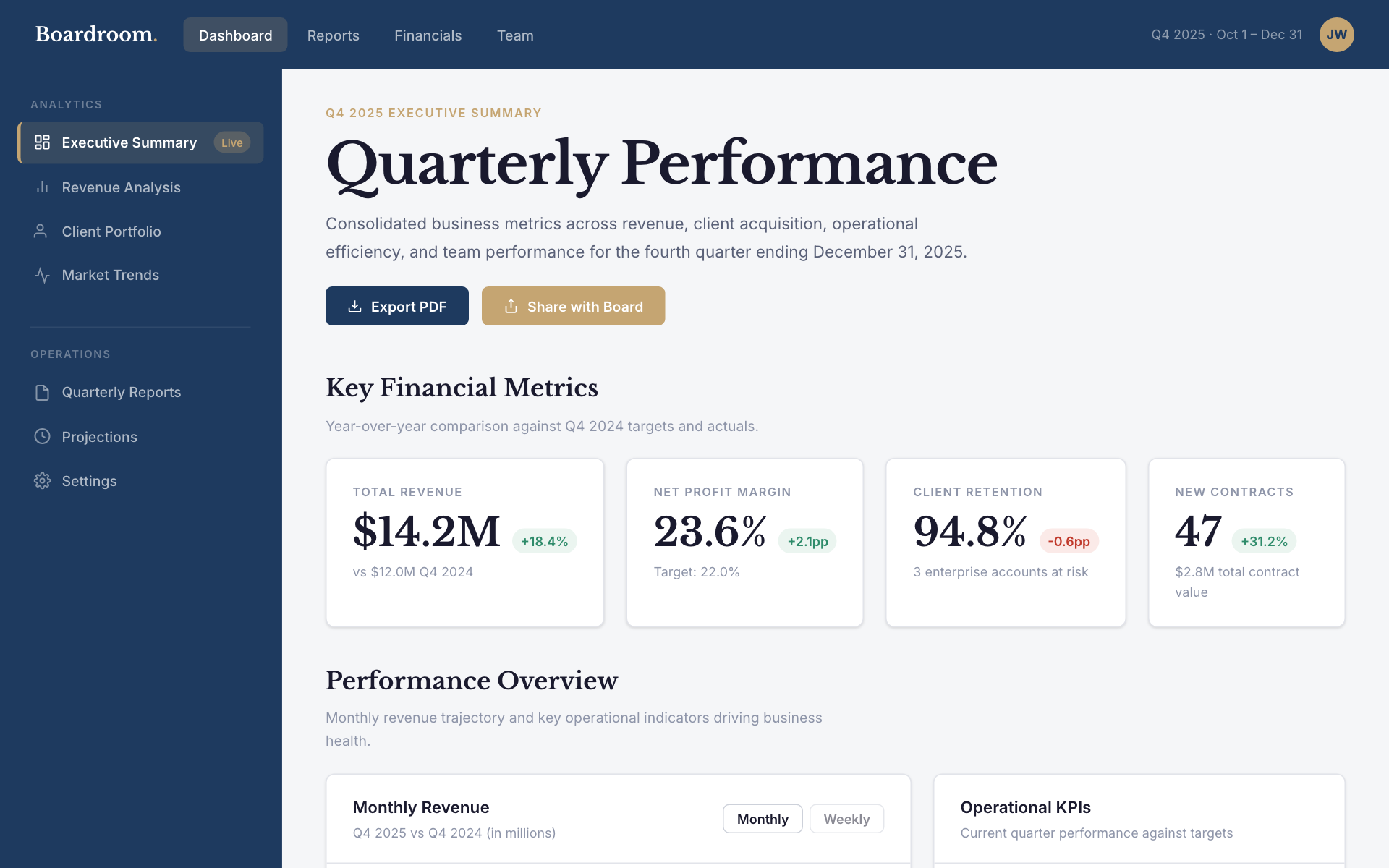
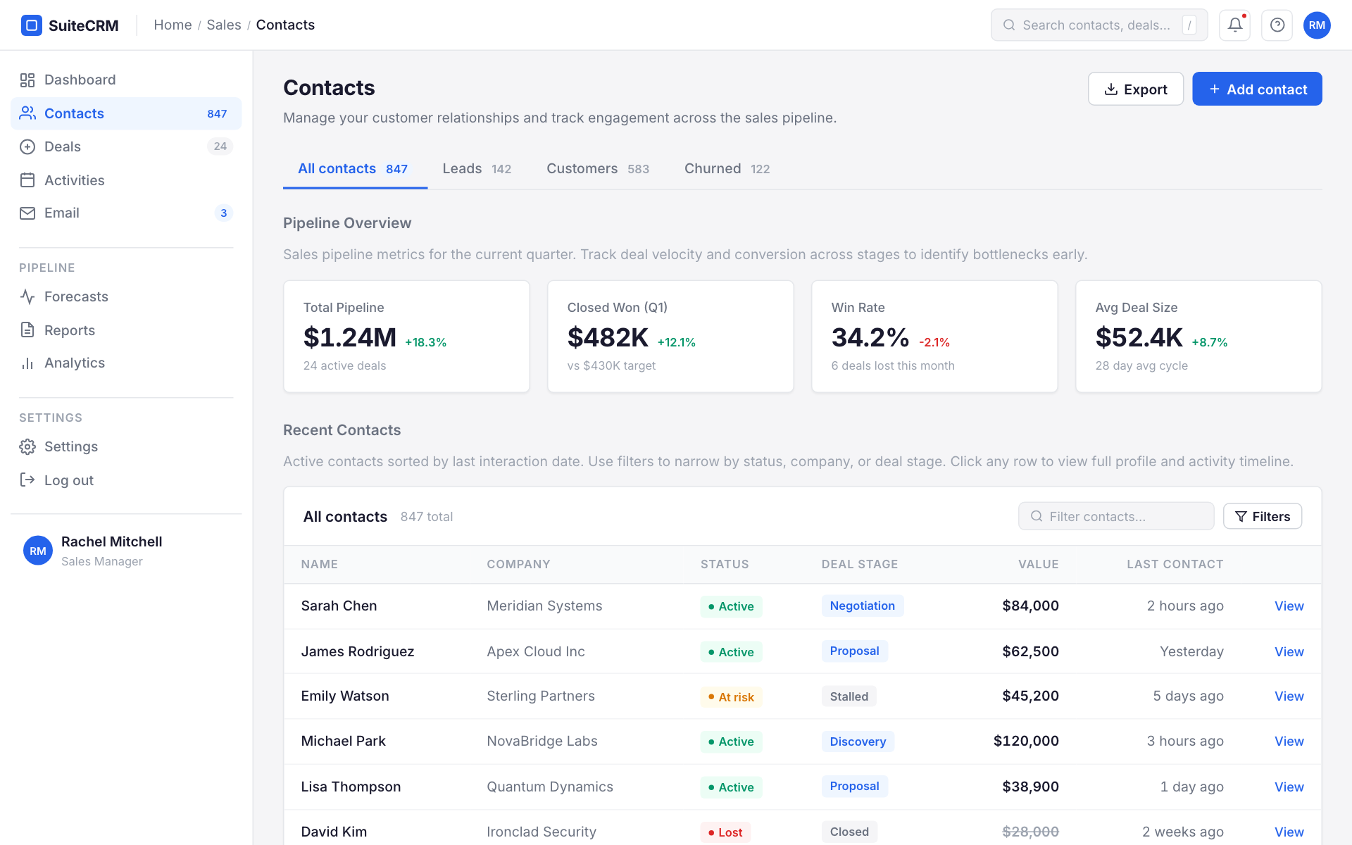
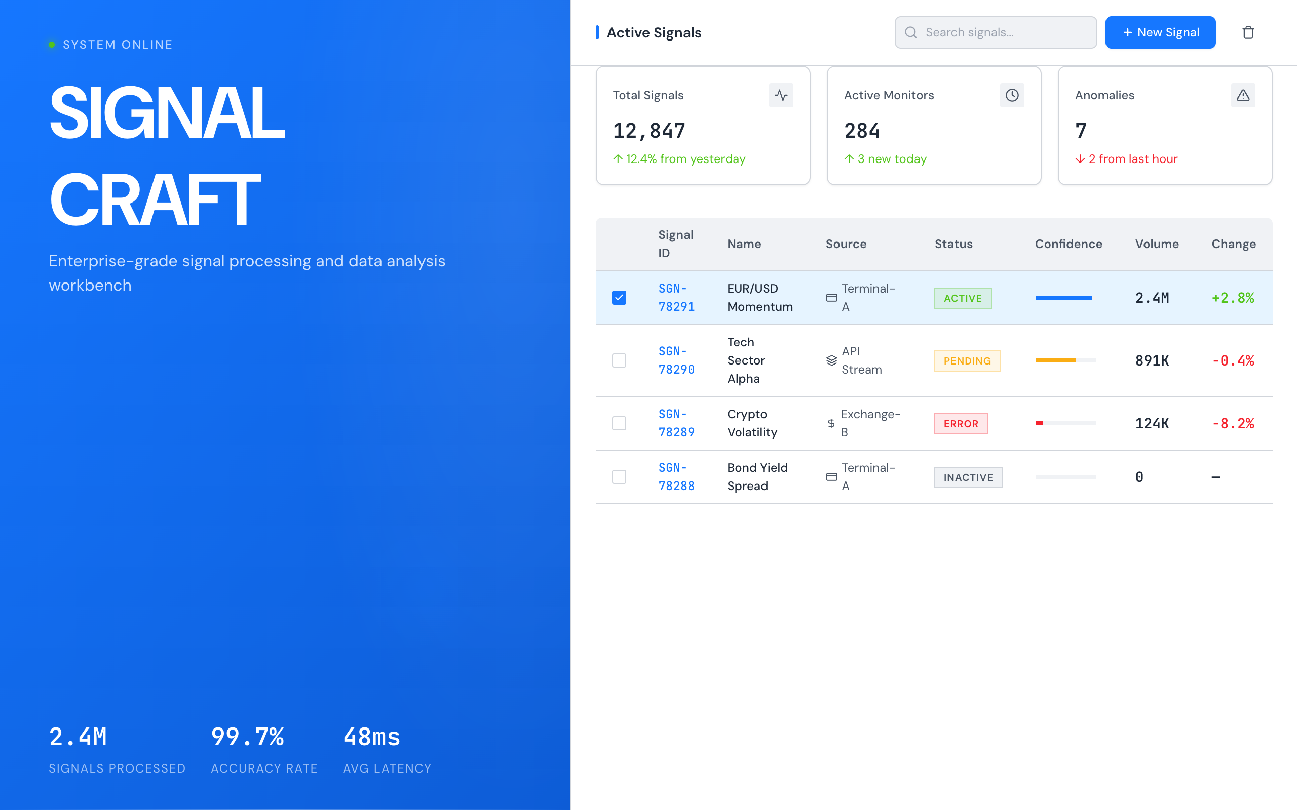
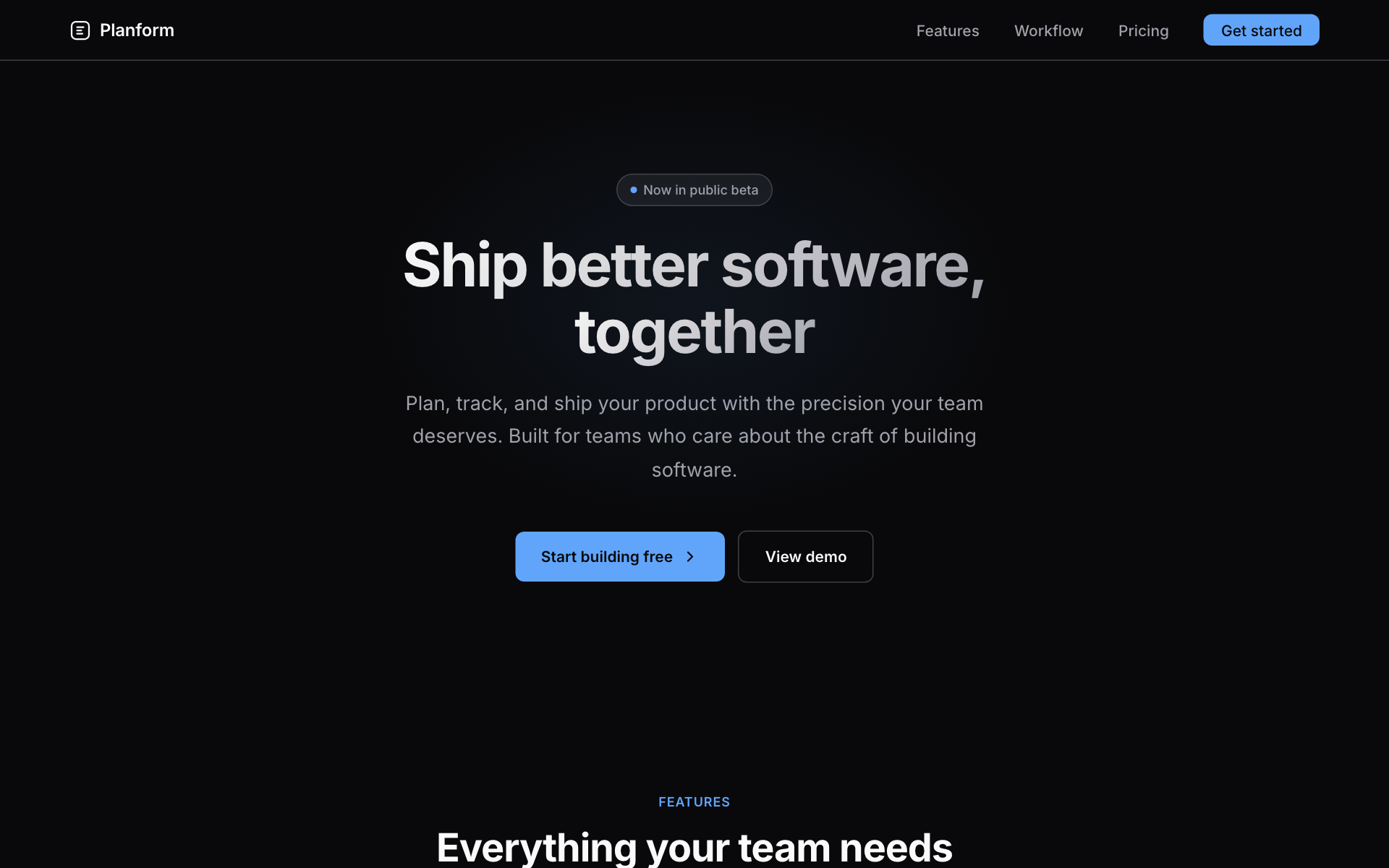
Atlas Dashboard is the design system for software that people use eight hours a day. It does not try to impress. It tries to disappear — to become an invisible layer between the user and their data. The interface earns trust through consistency, not charisma.

Every decision in this system serves information density. A SaaS dashboard that wastes space wastes the user's time. But density without clarity is chaos. Atlas achieves density through structure: consistent card containers, predictable spacing, and a single accent color that always means the same thing.

This is not minimalism for its own sake. It is engineering for comprehension. When a user glances at a stat card, they should know the value, the trend, and the time range in under two seconds. When they scan a data table, column alignment and alternating backgrounds should guide their eye without conscious effort.

---
Agent instructions (SKILL.md)(advanced)
Design Skill
Applies a professional SaaS dashboard design system to any web project. The result looks like a mature B2B analytics platform — clean, data-dense, and trustworthy.